Blog
13th May 2024
Simplicity and usability are important, but what do they really mean?
Blog
29th September 2022

UX/UI Designer


Simplicity and usability are important, but what do they really mean?
Today I’ll be talking about why I believe User Experience and User Interface design (UX/UI) are important. UX and UI are two interdependent terms. While UI generally deals with the interaction between users and computer systems, software and applications, UX deals more generally with a user's overall experience with a brand, product or service.
A well-designed interface anticipates user preferences, making it easier to use. Great UX/UI design focuses on different aspects, such as aesthetics, responsiveness, efficiency and accessibility.
According to this study from the Oxford Journal Interacting With Computers, the goal of UX design in business is to “improve customer satisfaction and loyalty through the utility and pleasure provided in the interaction with a product”.
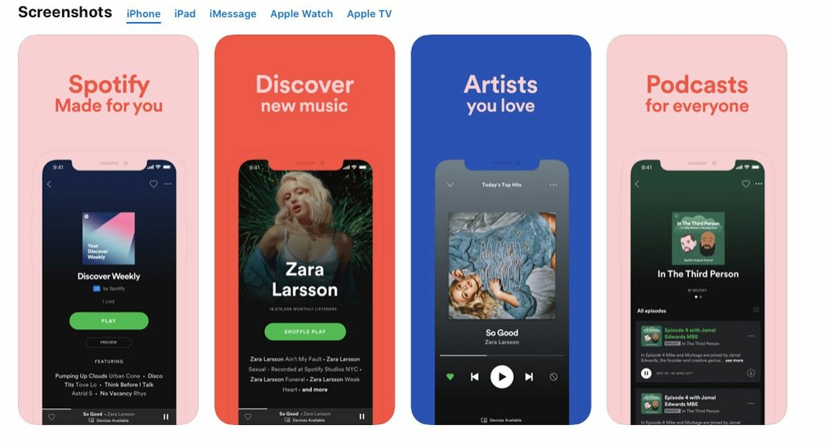
A good example of UX/UI design is Spotify which has demonstrated a great User Interface and intuitive User Experience that makes the app even more fun to use.
While you may think good design means something looks great, in truth, there is much more to design than just how it looks. On top of looking good, the product needs to perform well and wow audiences; in essence, good design must resolve any user problems that might prevent the product from selling well. If it doesn’t, then how good it looks simply doesn’t matter.
“All people say simplicity and usability are important, but what do they really mean?”
Some users will care more about how aesthetically appealing your product is without giving a second thought to how easy it is to use. Others will focus more on what your product says (eg. the brand values, brand promise, etc.) while ignoring all of your design efforts.
I think all of these points need to work equally because users will use your product from multiple devices: on their desktop at work, from their tablet or phone on the train. As a result, a well-designed product must work on any device and be efficient in its usability, readability and aesthetics.
This is just an example of how a simple heading and an arrow can confuse a reader:
Look left →
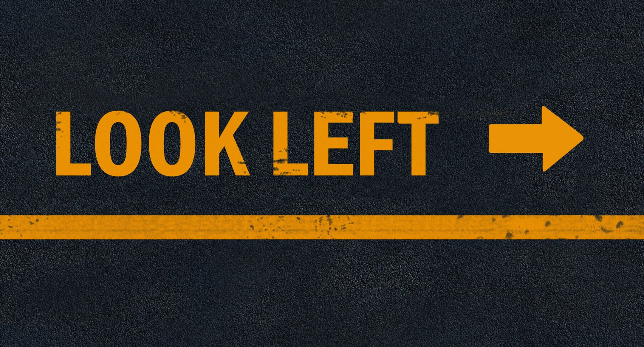
As we know, users don’t read content in detail, they scan the site looking for anything that is worth their attention. It is very likely they’ll skip text and headings, and jump straight to an eye-catching image, after all, a great image is worth a thousand words.
At Invicara, we truly believe in the power of UX/UI and we work continuously on improving it for our Digital Twin solutions. For example, Twinit.io makes it possible for developers composing Digital Twin solutions with complete flexibility to reflect a UX/UI that matches their needs.
The following two images illustrate examples of dashboards customised by our clients to meet their UI/UX requirements.
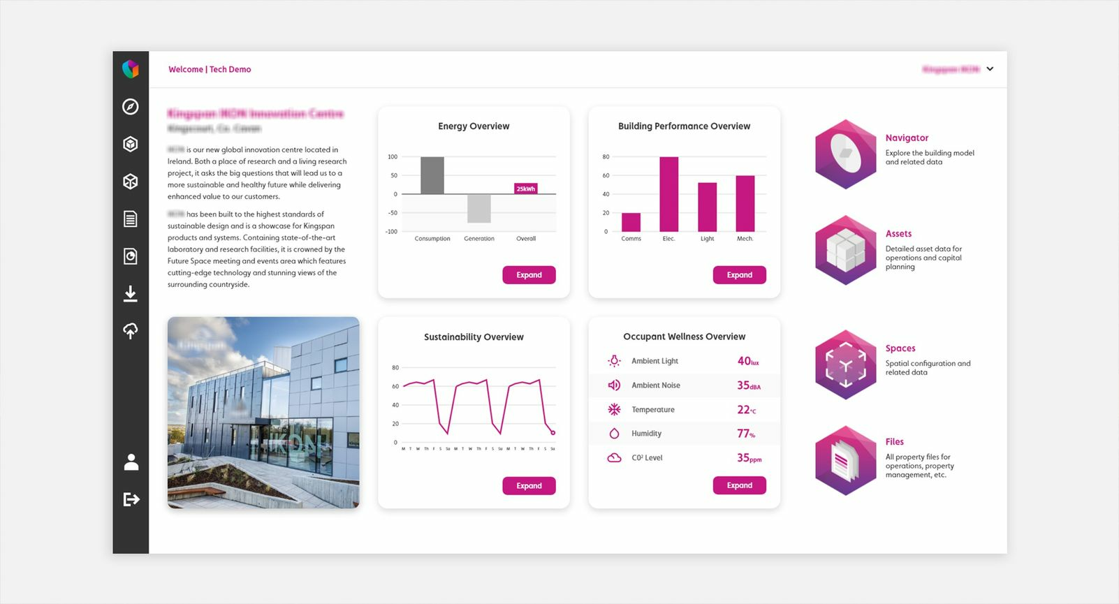
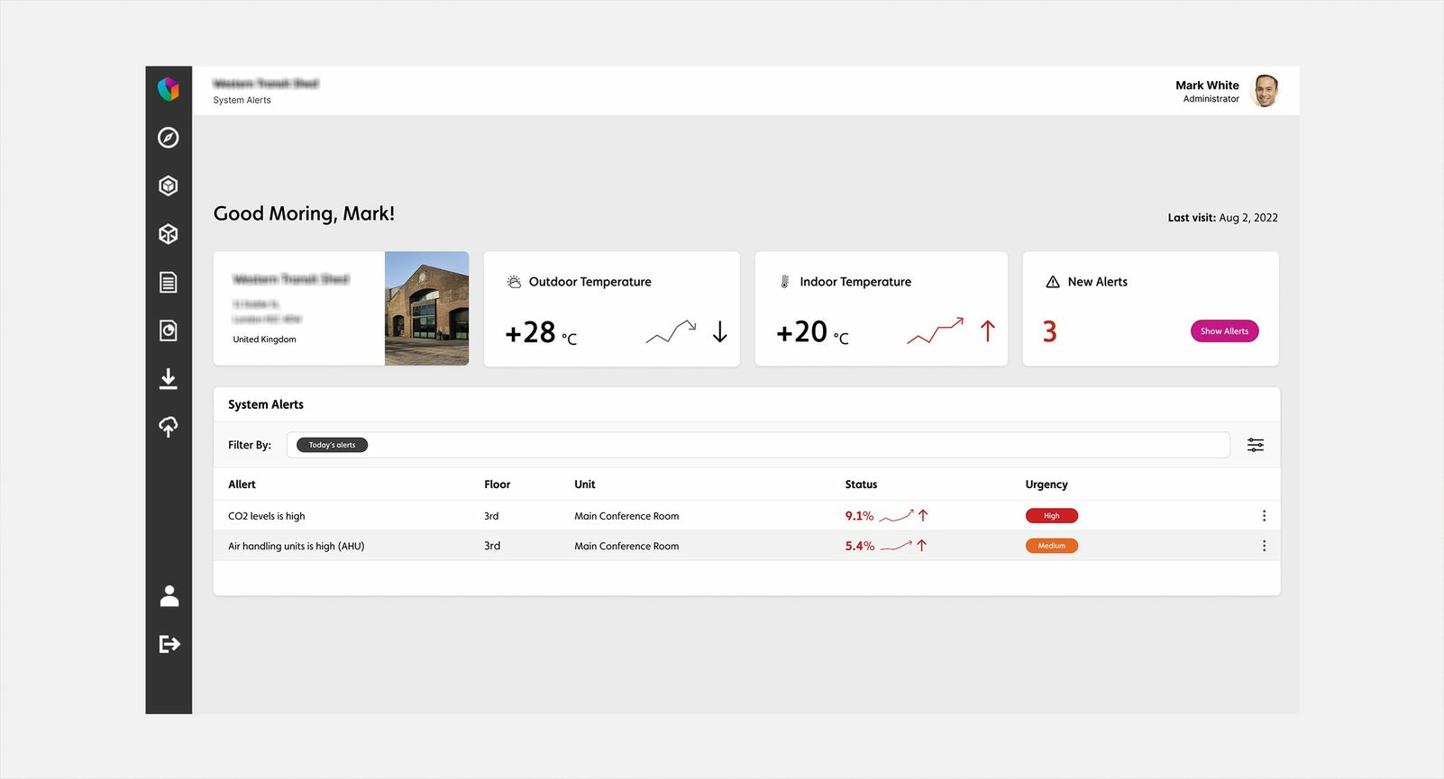
We might know that a digital twin is a digital representation of a physical environment, which collects real-time data; it's where the real world meets data science and computational engineering, if you’re interested in learning more about Digital Twin, check out our blog “Everyone Is Talking About Digital Twins, But How Do We Deliver?”. With this underlying complexity in mind, a well-designed application with a comprehensive user interface can save time, confusion, and frustration. During the application design cycle, we can test and validate an application better and understand how it is used, and what its user's goals are, increasing our chances of finding and solving problems before the application is in the world.
Conclusion
People want access to a business application that is easy to use and appealing to look at, and this can be achieved with great design. I truly believe good research will make a solution attractive and more engaging to users. The only way to do this is by understanding the needs of your target market and their preferences.
Are you ready to create a Digital Twin experience that addresses the needs of your business and users? If so, please reach out to us today.
Feel free to contact us by filling up the contact form on our website.
I’m a UI/UX designer at Invicara. Reach out to me if you would like to have a conversation. luca.amoriello@invicara.com
Podcast
12th January 2024
Blog
13th September 2023
Blog
3rd January 2023
Video
13th September 2022
Blog
19th August 2022
Follow us


